HamishLove the changes!! Thanks. :)
Hamish I love the new look!!! Just one thing, It would be difficult to add the option for cooring just the icon of entries?
Hamish Thank you for the update - this is a great one. Is the same planned for the mobile phone app?
Poor Barbara: Good suggestion, just tried it out and I like the look. It'll be included in next version
Resonant Carola: The app versions should be out already :)
Hamish Super, thank you!
Hamish OOOOH THIS HAS JUST MADE MY WEEK THANK YOU!
Just discovered the app and emailed you asking for a settings option to change font sizes [particularly on mobile] but I presume that's covered by this item. If so, sorry for the unnecessary email and thanks for a great app...!
Inappropriate Evvie: Ah yes - think I just replied to you. Hope you enjoy the update!
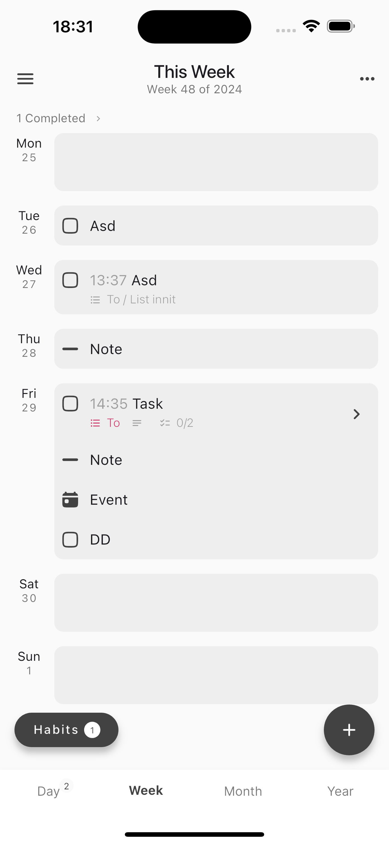
Hi everyone. I've had lots of feedback across the board from people finding the week view hard to read. I'm playing around with a new design for the week view. Please see the attached screenshot. It's just a start, but it gives the jist of where I'm going with it. In order to vote for it or not, please comment Hate, Dislike, Neutral, Like or Love depending how it makes you feel!
Hamish Like. I definitely appreciate the days being divided better like that. I would like to see more colour, like the list that task is on has a colour set. If the text of that whole task could be that colour, or something like that.. that would make it a love. :)
Tragic Anne-corinne: That's coming too ;)
Hamish Neutral to Like. I definitely like how the days are separated, and easy to see. My neutrality comes from the fact that I would like the day and date of each day to be larger. Possibly kept as a heading on top as opposed to a side heading. This is because when looking at the week view the first thing I'm scanning for is the day/date, then when I find the day I'm looking for I'll look at what's included on that date. If I'm scanning the entire week, similarly the most important thing is seeing the day and date stand out clearly for the separation of the days of the week. Just my two cents worth, at the end of the day if the days are just a little bit more easy to see than they are now I'll be happy so it's all good!
Hamish Like—this is a really nice design, makes things much easier to read. How will items assigned to the week (as opposed to specific days) appear?
Fine Teri: I think week entries will stay the same, at the top, taking up the full width.
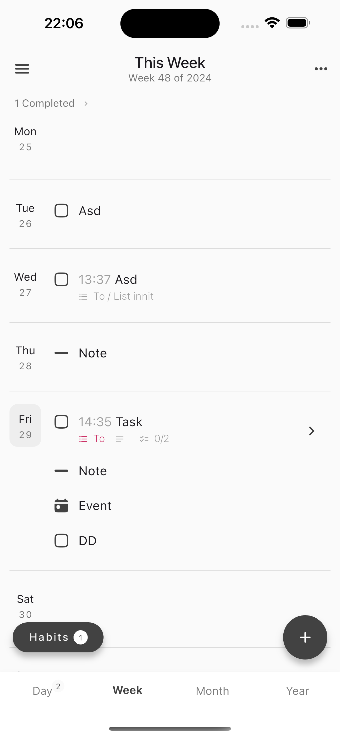
Another option is something like this. Same layout, a bit cleaner, but also less distinction between date area and entries area.
Hamish Like others have mentioned, the visual separation between each day is greatly appreciated
Hamish I prefer this one as is cleaner and more minimalist, like the app itself
Poor Barbara: Agreed - I'm going with that one
Possibly add more colour to the existing colour lists. So that when you assign a list a colour, tasks/notes in that list are populated in that coloured font (and/or highlight) rather than just the coloured dot with the list name. Just would make it a bit clearer, especially when colour-coding. For example, I have a colour for each family member, a colour for work tasks, etc. And it would be easier to distinguish in my daily/weekly view what is what with more colour.
Same for Desktop App on 5K monitor font is to small
This will be a a nice upgrade.
Note - Had a query from someone asking where the completed items go because they did not see the 'completed' dropdown
This is a big ask, but I’d love to see an option to move the Day-Week-Month-Year sections from the bottom of the app to be under the Timeline section in the sidebar. I find myself hopping between lists, tags, inbox, and various timeline views, so things would be more streamlined (fewer clicks/taps, eyes always know which part of the screen to go to) if all the navigation options were bundled together.
I need this feature, thanks
Great ideas :)
Ideally, it would be nice to have different font faces and sized. At least, don't size only - three options: small, normal, big.
I would love to be able to have a ”in progress” choice for a task thats not finished, arrows for migrated or scheduled. And the tasks in a list without a date, I would love to see them on the daily’s. I forget about them…
Would love the option to have a dot for a bullet point instead of a line. Not really important but for me makes them more distinguishable from the tasks.
Agreed 100%...the colors available right now are all very close and its hard to tell which is which sometimes.
Would like to see a better font style and the ability to change the font size (similar to Workflowy).
Cooing Lu: Noted
I have not seen this type of interaction before, but it sounds interesting - is this common on Android devices or something? Could you point me to an app where pinch to change font size is used?
Hamish: In Android, the Google Messenger app, you can increase the font size view by pinching the screen.
"the visual separation between the days on the weekly view must be more visible. E.g. through lines or bigger font."
I'm on twitter @ShubrankMukhiya
Agreed! Colors, backgrounds, fonts, etc. thanks!!
Hi everyone, this is live now! In settings > preferences under 'Appearance' you can now - Change text size - Change font weight - Customise entry icons - Change how entries are colored based on list I only didn't add more colors. The reason being that I will hire a designer next year who can come up with a proper system for colors Enjoy!